Mental Hurdle: The Home Page is Not Your Front Door

Most people trying to throw together a website think of the homepage as their entry point, their welcome mat, their “Hello, thanks for coming.  How can I help you?”  But how realistic is that?  Well, let’s analyze me (you can insert yourself here) and my weekly web wanderings.

What homepages have I seen this week?

It has been places where I am a repeat offender: iStock Photo,  All Recipes, Eat Better America, NPR, Etsy and Hulu.  I show up to these places as a starting point for something that I am searching for.  Each has a handy search function on the homepage.  I am familiar.  I know how to use the sites.  There is no “welcome” or sales pitch necessary, just easy navigation please.

When do I enter a website from somewhere else?

Practically, every other time I use the web!

My Google searches this week included research on leasing technology equipment, html tags, and green gift guides.  None of these took me to a home page.

Google wasn’t the only source of my web wanderings.  My visits to Social Living, SnapFish, and Wix were all the direct result of marketing e-mails.   Not a single one of these took me to a homepage.

So where did they take me?

The effective ones took me to a specifically designed landing page.  Through my own web searches and the e-mail marketing links that brought me in, the companies knew exactly what drew me to their site.  My entry point to their websites was tailored to the reason I was surfing the web.  I did not have to read through their menus or find the search box or really do much thinking at all.

If a business is blessed with the specific knowledge of what drew the customer in, it seems wasteful and inattentive not to use it.

Using It

In short, using it means providing a tailored advertisement and action motivating page all in one.  While putting this page together, here are some things to keep in mind:

  • Be goal oriented. Remember your conversion goal and make that the most natural, clickable path.
  • Keep it simple.  This page should not be distracting.
  • Give them what they want.  You know why the user landed here.  So don’t offer 800 other options.
  • Keep it attractive and professional.  Make sure that this page instills confidence in the business.
  • Be clear and concise.

Hmm, be clear and concise.  Seems like a good note to end on.  Go do it.

A Late Adapter Tries New Things

Flock and RockMelt are two new browsers that integrate your most visited sites into your browser.  They make sure your social networking tether is short and securely bound, even when you are searching for a new pair of shoes.

Setting Expectations

The first that I heard of this type of browser was a story on Marketplace. The head of RockMelt, Eric Vishra, said that the average user only goes to about five to seven websites each day.  Yet, they go to these sites repeatedly throughout the day.  He went on to say that the typical browser has not updated to adapt to the way we use the internet. 

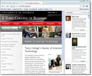
RockMelt, as well as Flock, looks to provide the user with access to all of their most frequented sites at one time, without requiring them to move around from one site to another to find updates.  Instead they seek to present the social networking experience and other favorite feeds while handling other web browsing.  Based on the video their on main page, this is provided via two main additions: an online friend display on the left of the screen and on the right a streaming feed of information from your favorite sites.  

Based on the video?  I know what you are thinking; Rebecca is too lazy to actually try out the browser. 

You would be wrong.  I went to RockMelt’s site, which directed me to my Facebook, which allowed me to request the browser, which then informed me that I would get to download the browser in a couple of days. 

Well, Flock it. 

I’ll just use another social browser.

The Flock web browser shows the FB feed on the right and the open window on the left.I am motivated to try this out right now.  Instant gratification, in this case, was provided by Flock, a competitor’s social browser.    

So, it is day two on Flock. 

As I started out with, I am a late adapter and generally wary of knew things that have the potential to stealthy winnow either of two precious resources; my time or my money.  I joined Facebook about six months ago, dragging my feet due to concerns for the first resource.  I walked away from the AT&T kiosk clutching my iPhone about a year and half ago, hemming and hawing about the second resource.  This could end up being a similar love-hate relationship….but it is still up in the air.

I found that I had a couple of initial small disappointments.  The Facebook feed appears to only provide the posts by other users.  To me this misses an important element, the crucial update when a friend is tagged in a photo.  I haven’t seen how I am updated with my notifications other when I just log in.  This may be because the comments on my wall and messages may have been after I shut down for the evening.  I am not sure.  Also, not exactly a disappointment, but Flock did not have the left frame list of friends online that RockMelt boasted. 

Like Facebook and the iPhone, it appears to be something that I have to give some time before passing judgment.  I would need to spend some time setting up appropriate feeds and, possibly, making groups and learning how to use features that I believe are there…but have not yet explored.  In the mean time, I have already learned a couple important lessons:

  1. This is not the browser in which to do research for one’s homework assignment or have anywhere near a work related computer.
  2. One mediocre FB update, can distract me for 15 minutes and leave me completely lost, having no idea as to what I was doing prior to the rabbit hole or what led me to said fissure.

After learning these lessons, I realized that to give this an honest chance, I needed to use the tool as intended.  Last night, I decided to use Flock while intentionally wasting time.  As my whole goal was to goof off, shop for shoes, see what handy things clever people were making on Etsy, and keep in touch with friends and family, Flock worked out well.  I am thinking I’ll give it a week and see how it goes.

Web Want to Usability

Yes.  I am making up lingo.

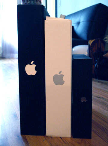
Three stylish little Apple boxes each smaller and cuter than the last.The podcast on Innovations in Web Input brought up an interesting Apple phenomenon.  We all like to get packages and open new things, but Apple takes it to another level.  Opening an Apple product is an event.   People actually take pictures of each stage of the opening of their Apple box.   The box that your new MacBook or iPod comes in is clever and interesting.  The packaging adds to the event and is part of the overall experience. 

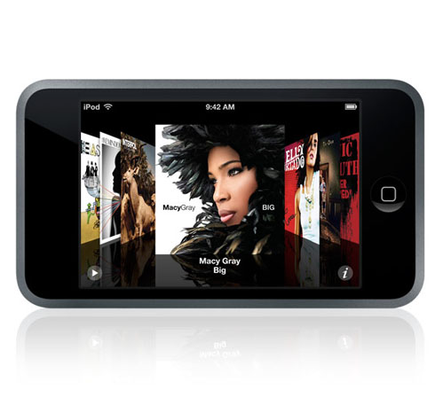
The reason I bring this up is because Apple takes it past simply trying to make something easy to use to something that people want to use.   There is a difference.  Think about your first iPod; playing with that dial and watching the brightly lit album covers slide across the screen.  Think about getting the touch screen iPhone and using your finger to flip through pictures and then zooming with your pointer and thumb.  I zoomed in on so many pictures that I didn’t even want to see in detail, just because it was so fun.  I liked it enough to try to think of more ways to use the phone.  Even now that it isn’t new, I pull it out and “slide to unlock” for no reason and then think, “what do I want to look at?”  I just want to use it. 

In my previous post, I discussed basic web usability.  In the stepping up to want to usability, basic web usability cannot be left behind. Sticking with my Apple example, the Apple website follows the rules; the logo is in the top left corner of every page ready to take me right back to the homepage, the search box is in the top right, my menus are always available.

The want-to comes from the extra touch of finesse.  In the Store section of the website, the search feature helps you along.  Type in an “ip” and it will give an assortment of suggestions without even hitting “Enter”.  Check  out the iPod engraving gallery.  It allows the user to select various sayings and iPod colors and then shows you what your new engraved iPod will look like.  

Web want to usability is not quite as simple as web usability.  It can’t be condensed to a handy checklist.  It is going beyond trying to not frustrate the user during their experience, to making the user think of excuses to experience the site again.